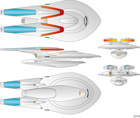
Diagramming out spaceships has been an on-and-off hobby of mine for at least 20 years now, though I don’t have a lot to show for it.
This design was inspired by a sketch that Alex Jaeger made for a ship that was supposed to appear for about five seconds during the space battle in Star Trek: First Contact. Called “USS Criterion,” the design came to my attention thanks to this video from Trekyards.
It makes sense to me that the design wasn’t chosen for the movie—from up close, it looks a lot more similar to the Enterprise-E than the Akira class, Norway class, Saber class, and Steamrunner class, the four new designs that did appear in the movie. And from a distance, I think it would just look like a blob. But still, it was interesting enough that I thought I’d see if I could do something with it.
The opinion of the Trekyards guys, which I basically agreed with, was that the top view was nice but the side view was…not, so I decided to mostly keep the top view—I literally traced the lines over an image of the original Jaeger sketch—and come up with a new side profile to fit it.
I flattened out the warp nacelles and gave them some styling elements inspired by the Type 11 shuttlecraft and the captain’s yacht from Star Trek: Insurrection, and then gave the secondary hull a kind of pontoon look that’s vaguely reminiscent of the Oberth class.
Because the warp engines connect directly to the saucer section, I’m saying that’s where the warp core and Main Engineering are, so what you’d normally call the engineering hull actually just holds the main shuttlebay, the deflector dish, and a lot of cargo storage. So technically, it’s more like a third nacelle, only without the extra warp engine. #clickbait
Most of the other details I took from the Sovereign class. It seemed like the top view gave it the Sovereign’s overall sleek aesthetic in a more compact form, which kind of reminded me of the Nebula class, another design I’ve always liked as a kind of unassuming workhorse vessel.
The lore I made up was that after the Galaxy class, Starfleet wanted its next series of mainline starships to have smaller, more specialized designs. The Sovereign was optimized for firepower, while this was built for range and endurance, with a lot of cargo capacity and a ludicrously redundant propulsion systems I have this idea that it could shut down up to half the coils in each nacelle for maintenance, or half the Bussard collectors, and still function—which is why the nacelles are so huge.
When I made this design, I laid it out to have 18–19 decks, which is way too small—I envisioned the ship being about two-thirds the size of the Sovereign class with a crew of about 500, but 19 decks would make it about the same size as the Intrepid class, which has a crew of about 150. Then again, I didn’t even bother adding window rows or anything, so I might re-scale it to be about the same height as the Sovereign class. Or leave it alone and just say that’s how big it is.
I named it “Condorcet” after the Marquis de Condorcet, who Wikipedia tells me developed the Condorcet criterion.